Warning: Beware the p!

We recently stumbled onto a delightful demonstration called dance of the values by statistical cognition researcher Geoff Cumming. If you have ten minutes to spare, we highly recommend that you watch this video. If you don’t have ten minutes to spare, then we can save you some time and summarize the video in three words: “don’t trust .” In the video, Cumming sets up a series of experiments to demonstrate the fickleness of the . In this post we reproduce his demonstration in R.
The value is usually associated with a technique called statistical hypothesis testing, which is a sort of algorithmic litmus test to see if the results of an experiment is “statistically significant.” The reasoning behind values dates back to the 1770s, though they didn’t become popular until Ronald Fisher re-introduced them around 1920. Statistical hypothesis testing involves choosing a null hypothesis (often called ) and then calculating a value, which is the probability of a result at least as extreme as the one observed, if the null hypothesis is true. In mathspeak, we express this as:
If the calculated value is below a certain threshold, usually , one rejects the null hypothesis and declares the results significant.
The main problem with values is that they are easy to calculate and hard to understand. Indeed, we see far more literature dedicated to explaining what values are not than to what values actually are. Despite this, values are quoted everywhere in areas such as medical research, and are just as often miscalculated, misinterpreted, or downright abused. Even worse, values are an overrepresented ingredient in many important decisions, such as the difference between publishing a study or not, decisions about receiving tenure or not, or decisions involving public policy.
Cumming’s demonstration consists of a series of simulated experiments. He takes samples from two normal distributions with different means, and calculates the value corresponding to the difference of the means (his null hypothesis is, presumably, that the means of the two distributions are the same). Then he does it again, and again and again. The results are astonishing. His first three simulations yield values of 0.000, 0.125, and 0.504. This can be interpreted as one highly significant result and two results of no statistical significance, and this is all done without changing any parameters of the experiment.
Here we replicate his results in R. We generate a control group of samples from a distribution, and a test group of samples from a distribution. Our null hypothesis is that the two populations have the same mean.
We secretly know that the two populations were artificially generated from standard normal variables with prescribed parameters, but for the rest of the experiment we must ignore this fact. We calculate the sample means and and sample variances and of both groups, and use these to create a -statistic given by the formula
This statistic is one sample from a distribution equal to Student’s t-distribution with degrees of freedom. The value is then
where is the cdf of the -distribution. This expresses the probability
that the absolute value of a random sample from the -distribution is at
least . The function is given by a formula too
ugly to reprint here but accessible in R by invoking the pt function.
library(ggplot2)
# change these parameters if you wnt
samplesPerExperiment <- 32
nExperiments <- 1000
# generate the experimental data
controls = rnorm(n = samplesPerExperiment*nExperiments, mean = 50, sd = 20)
tests = rnorm(n = samplesPerExperiment*nExperiments, mean = 60, sd = 20)
dim(controls) <- c(samplesPerExperiment, nExperiments)
dim(tests) <- c(samplesPerExperiment, nExperiments)
# this function calculate a p values
pValue <- function(nSamples1, mean1, var1,
                   nSamples2, mean2, var2) {
    delta <- mean1 - mean2
    sp2 <- ((nSamples1 - 1) * var1 + (nSamples2 - 1) * var2) / (nSamples1 + nSamples2 - 2)
    stderr <- sqrt(sp2 * (1 / nSamples1 + 1 / nSamples2))
    t <- delta / stderr
    pt(-abs(t), df = 2 * samplesPerExperiment - 2) +
        1 - pt(abs(t), df = 2 * samplesPerExperiment - 2)
}
# apply the pValue function to the experimental data
pVector <- mapply(pValue,
       apply(controls, 2, length),
       apply(controls, 2, mean),
       apply(controls, 2, var),
       apply(tests, 2, length),
       apply(tests, 2, mean),
       apply(tests, 2, var))
# plot a histogram
myPlot <- ggplot() +
    geom_histogram(aes(x = pVector,
                   fill = ifelse(pVector <= 0.05, "#56B4E9", "#E69F00")),
                   binwidth = 0.05,
                   color = "white") +
    scale_fill_discrete(name = "Significance",
                        labels = c("p <= 0.05", "p > 0.05")) +
    theme(axis.title.x = element_blank()) +
    theme(axis.title.y = element_blank())
# ...profit!
plot(myPlot)
# print out stuff
print(sum(pVector <= 0.05))
print(sum(pVector > 0.05))
print(summary(pVector))
=== output below ===
[1] 528
[1] 472
     Min.   1st Qu.    Median      Mean   3rd Qu.      Max.
0.0000017 0.0086350 0.0418600 0.1444000 0.1918000 0.9951000
This yields the pretty histogram below.

In particular, we see that among 1000 simulated experiments, we have
-
528 simulations with values less than or equal to 0.05, thus statistically significant by convention
-
472 with values that are not significant by the same convention
-
A minimum value of 0.0000017
-
A maximum value of 0.9951
This yields an almost 50/50 split between “significant” and “not significant”. With a sample size of only 32, the value is not a reliable measure of anything!
Unfortunately, it is not uncommon for experimental studies e.g. clinical trials to be this small. This has led to an overabundance of published medical studies with irreproducible results. Sometimes this the case for legitimate reasons such as cost and/or availability, and other times the researchers simply don’t know or don’t care about statistical rigor.
Not surprisingly, changing the sample size to 10 or 100 makes the histogram of
simulated values much wider or much tighter. We ran our simulated
experiments again, changing only the value of samplesPerExperiment to 10
and 100. This yielded the following two histograms for values.
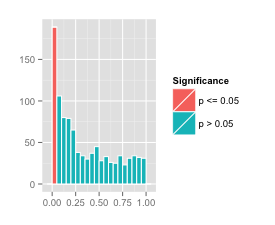

The small sample size 10 had 189 out of 1000 simulations yielding a value of below 0.05. The histogram of values is on the left. Although these could be labelled as “statistically significant” by an unscrupulous researcher, we claim that none of the results are particularly significant; they just happen to be lucky.
The larger sample size 100 had 943 out of 1000 simulations yielding a value of below 0.05. The histogram of values is on the right. The value in this case is much more reliable. Perhaps we should revise our original statement to say “don’t trust for small experiments.”
We encourage our readers to tinker with our R code above to generate more histograms of values under varying conditions.
blog comments powered by Disqus